In the Historical Analysis Page you can investigate and test the strength of the traditionally accepted economic relationship between asset classes and underlyings and simultaneously perform research for new and developing relationships.
For example, you might want to test the relationship between:
Interest rates differentials and exchange rates
Equity markets and changing yield curve slopes
Implied volatilities within and between asset classes
Gold prices (and other “safe haven” and equity prices)
Following are a number of examples as to how you can use this tool:
Example for the IR asset
You can view correlation between a single currency's interest rates for a short tenor versus a long tenor, e.g., between a 2-year and a 30-year USD swap rate. If you expect a certain change in the short-medium tenors in the future, being able to see the correlation between the behavior of the short and long-term tenors for a defined period in the past will let you better understand how your predicted change to the short-medium tenors may affect the long-term tenors (based on what has happened in the past).
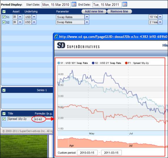
You can also chart the spread between swap rates of different tenors. For example, you can define two time series definitions, one for a 2-year USD swap rate and one for a 10-year USD swap rate. You can then see the spread between them by creating a formula to plot the difference between them, as seen in Figure 1.
Figure 1: The Red Line Shows the Spread Between Two IR Swap Rates
You can also use the tool to see the link between different underlyings:
Example 1—WTI and USD/NOK
Correlations between the world's most heavily traded commodities and currency pairs are common. For example, you are a Norwegian oil company (your home currency is NOK) and you are long WTI, so you have an exposure to the USD/NOK spot rate.
In the Historical Analysis tool you can plot the USD/NOK spot rate and the WTI nearest futures. In the created graph in Figure 2 you can see that over the defined period when the WTI price went up the USD/NOK went down (i.e., the NOK got stronger) so a Norwegian oil company would receive less NOK; similarly, when the WTI price went down the NOK got weaker.
So you can see that the changes in the prices of WTI and USD/NOK have historically offset each other, providing you with a natural hedge.
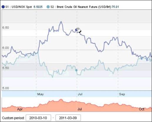
| Figure 2: | The Graph Shows the Relationship Between WTI & USD/NOK |
Example 2—Slope of Yield Curve Versus Equity Index Performance
Traditional economic theory suggests that a downward sloping yield curve is a leading indicator of economic decline given.
The graph in Figure 3 plots the slope of the GBP Yield Curve (10yr minus 2yr Swap Rates) versus the performance of the FTSE 100. You can see that the flat/negative slope in early 2007 was followed by a rapid decline in the market.
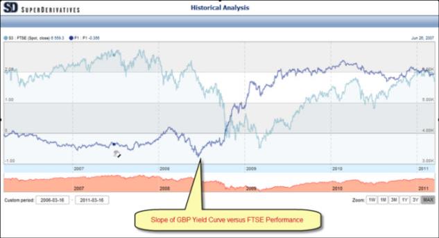
Figure 3: GBP Yield Curve Versus the Performance of the FTSE 100