In the Historical Analysis Page once you have created one or more charts, in each chart you can then carry out a number of tasks. These include the following:
Scaling Back to 100% on a Defined Date in Generated Historical Analysis Charts
Printing a Generated Historical Analysis Chart
Adding a Trend Line to a Generated Historical Analysis Chart
For more information on manipulating the display of the generated data see the "Working with generated charts" topic in the online help.
Scaling Back to 100% on a Defined Date in Generated Historical Analysis Charts
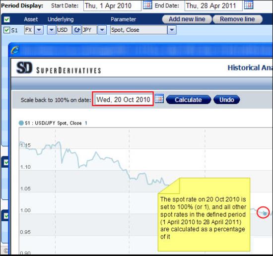
For each chart you can instruct the system to set the parameter value on a defined date to 100%. The system then plots the parameter value on each of the other dates in the defined period as a percentage of the parameter value on the defined date (which is itself set to 100% or 1) as seen in Figure 1. Of course, if you have multiple plotted lines in a single chart the system carries out this action for each line individually.
In addition, if you have created a number of charts, you can control this feature for each chart individually.
After applying this functionality, to return to the original chart click the Undo button.
To scale all parameter values to a percentage of the parameter value on a defined date:
| 1. | After generating your chart in the window that opens in the Scale back to 100% on date field enter the date for which you want to see the value set to 100%. |
| 2. | Click the Calculate button. |
Figure 1: Scaling All Parameter values to a percentage of the parameter value on a defined date
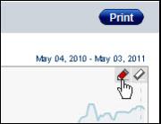
Printing a Generated Historical Analysis Chart
Once you have generated a chart you can print it. You do this using the Print button.
If you have created a number of charts, there is an individual Print button for each chart.
To print a generated chart:
| 1. | After generating your chart click the Print button. |
| 2. | In the Print window click the relevant printer and then click the Print button. The chart is printed. |
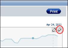
Adding a Trend Line to a Generated Historical Analysis Chart
Once you have generated a chart you can now also create a trend line. This is the line formed when you draw a diagonal line between two or more price pivot points.
Trend lines are a widely used approach in technical analysis, which is a discipline to forecast the direction of prices through the study of past market data.
In the Historical Analysis tool once you have generated a chart you can:
Add a trend line.
You add trend lines using the Pencil button as seen in Figure 2. When you have activated the tool the hand icon becomes a crosshair icon which you click and drag to create line. To turn off the tool while retaining the trend lines, click the Pencil button again.
| Figure 2: | Activating the Trend Line Tool |
Remove all displayed trend lines.
To remove all displayed trend lines you use the Eraser button as seen in Figure 3.
| Figure 3: | Deactivating the Trend Line Tool |