In the Historical Analysis Page, once you have defined the data you want to chart, i.e., the time series (Working With Time Series Definitions), correlation definitions (Working With Correlation Definitions) and formulas (Working With Formulas) you are ready to create the charts.
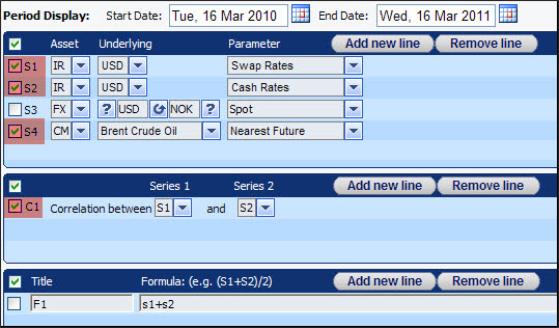
Each chart can include any or all of the data defined in the page. You indicate what data to include by checking the relevant lines. In each of the three sections, you define which of the lines you want to chart by checking the relevant checkboxes. For example, in Figure 1 you are telling the system you want to chart S1, S2, S4 and C1.
Figure 1: These Checkboxes Tell the System Which Lines You Want to Chart
There are a number of charting options available.
The simplest option available is to create a single chart which includes all checked lines.
You do this by clicking the Chart button as seen in Figure 2.
You can include any number of lines in a single chart. However, if you do this you should note that the different lines may consist of very different scales of data. Accordingly, if the last value of a data set is at least double the last value of another data set in the same chart then the system automatically uses two scales, one on the left axis and one on the right axis. In those circumstances the system will assign each checked line to the most appropriate axis for its data points.
|
|
If you do not want the system to use two scales you should use the other Chart button and make sure that all lines are assigned to the same axis. |
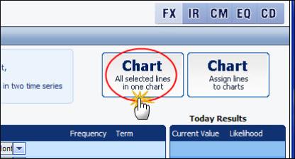
Figure 2: Charting All Selected Lines in One Chart
The advanced option gives you greater control over which checked lines are included in which chart and on which axis. This option lets you:
Choose which checked lines to include in each chart. For example, each checked line can be in its own chart. Or you can combine a checked line with any or all of the other lines.
Whether you create a single or multiple charts, for each line you can also decide whether its data should be plotted on the left or right axis.
You do this using the Chart button as seen in Figure 3.
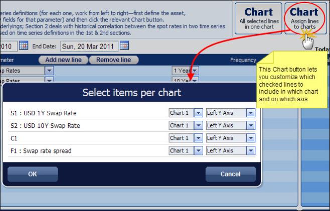
Figure 3: Assigning Different Lines to Different Charts and Axes
Once the system has generated the chart you can see:
The plotted data.
A scroller area at the bottom of the mini chart. This is a simplified representation of the entire data set.
You can then:
Print them and scale all parameter values to a percentage of the parameter value on a defined date (see Working with Generated Historical Analysis Charts).
Manipulate the display of the generated data. See the "Working with generated charts" topic in the online help.
To create charts:
| 1. | In the Historical Analysis page in the Period Display area define the period for which you want to see the data charted. See Defining the Chart Period Definition. |
| 2. | Create all the relevant time series, correlation definitions and formulas. |
| 3. | Specify which time series, correlation definitions and formulas you want to chart. |
You do this by checking the checkbox next to each line you want to chart.
To:
Create a single chart which includes all the checked lines click the Chart All selected lines in one chart button.
Customize what is included in each chart:
| a. | Click the Chart Assign lines to charts button. |
| b. | In the Select Items Per Chart window assign each line to the relevant chart and decide on which axis you want to see its scale, as seen in Figure 3. |
| c. | Click OK. |
A new window opens containing as many charts as you specified. The charts specified in the Step b will be displayed as shown in Figure 4.
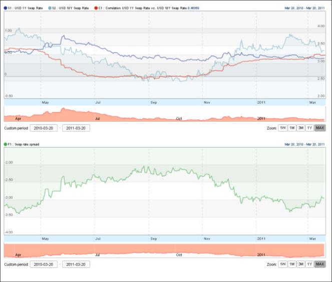
Figure 4: Lines Assigned to Different Charts and Different Axes