From the Yield Curve window you can choose to see the following rates categories in chart format, each displayed in its own chart:
Zero coupon rates
This chart shows the data from the currency’s default curve only.
Discount factors
This chart shows the data from the currency’s default curve only.
Forward rates (or implied rates)
This displays the forward rates for the following indexes—1m, 3m, 6m and 1y.
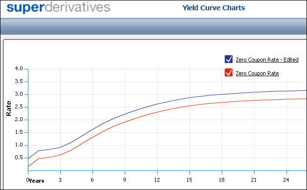
If you edit the yield curve data, when you then access the yield curve charts, for each category you see a line for the current data1 and a separate line for the edited data, as seen in Figure 1.
Figure 1: Charts Show Both Current and Edited Yield Curve Data
In the window you can then work with the generated charts. See Working With the Generated Charts.
To create the yield curve charts for a specific currency:
| 1. | In the Yield Curve page, display the yield curve for the currency and trade date you require. |
| 2. | Click the Charts button. The Yield Curve Chart window opens. |
Working With the Generated Charts
In the Yield Curve Charts window you can:
See the exact rate at a given point.
Point at a place on the line to see the exact rate at that point (as seen in Figure 2).
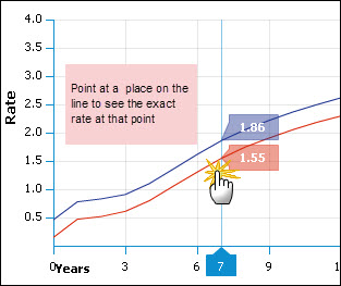
| Figure 2: | Seeing the Rate At a Given Point |
Zoom in to a chart’s details.
You can enlarge a selected area of a chart. This is useful when studying a chart that spans a long time period and you would like to see data for a specific section of that period more clearly. After zooming, the chart only shows the selected area.
To zoom in on an area of the chart:
| 1. | In the chart click and hold the left mouse button at the corner of the area you would like to zoom in on. |
| 2. | Drag the cursor to the opposite corner of the area you would like to zoom in on. As you drag the cursor a blue block appears over the selected area. |
| 3. | Release the mouse button. The chart is redrawn, zooming in on the area of the original chart that you selected. |
To return to the original time period after zooming:
Click the Show all link.