In SDX Interest Rates there are a number of different yield curves, including the regular Yield Curve, the Inflation Curve, the OIS Curve and the BMA Curve.
In all of these yield curves:
Editable text is displayed in a textbox
Text in a box can be edited by the user. Any text that is not displayed inside a box cannot be edited; however, it may be affected by the other text that is edited by the user.
Blue background indicates edited data
After you manually edit a value in a yield curve page (whether you do this by manually editing the new value or via the parallel shift feature), the background of that field turns blue.
|
|
In the Yield Curve page, once you have manually edited an interest rate or price for a future tenor, the corresponding price or interest rate is also automatically updated and also subsequently appears with a blue background. |
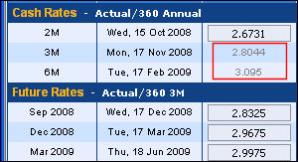
Grey text indicates data that is not in use
Grey text is used for market data or interpolated values that are not currently used for the calculation of zero rates due to the concept of data precedence (see Understanding the Concept of Data Precedence).
|
|
Grey text is only used in the Yield Curve page, not in the Inflation, OIS and BMA curve pages. |
In the example seen in Figure 1 the dates of the last two cash tenors fall within the date range covered by the Future Rates, and are thus not used for the calculation of the zero rates. This is because the 3M cash rate falls within the September 2008 to 17 December 2008 period, and so the future of that period is used instead; the 6M cash rate falls within the December 2008 to 17 March 2009 period, and so the future rate of that period is used instead.
| Figure 1: | Grey Text Indicates Rates That Are Not in Use |
Blue text indicates interpolated data is in use
Where an interpolated value is used for the calculation of the zero coupon rates, it is shown in blue as seen in Figure 2.
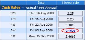
| Figure 2: | Blue Text Indicates Interpolated Rates |
However, interpolated values that are not used for the calculation of the zero coupon rates due to the concept of data precedence (Understanding the Concept of Data Precedence) are displayed in gray.
Red text indicates invalid data
When creating a curve (whether the regular yield curve, the inflation curve, the OIS curve or the BMA curve), the system checks the validity of the displayed data.
Sometimes, an interest rate value that you enter or that was obtained from the market cannot be included in a smooth curve with the other data points. In such an instance, the value is displayed in red. This is because the system has concluded that specific value cannot form part of the same curve as the other rates displayed.
In addition, you may enter a value that is acceptable for the creation of the yield curve, but it results in subsequent data points being invalid. Such an occurrence is seen in the Figure 3, where the edited value of 8 for the 2Y tenor is acceptable, but necessarily results in the values of the 3Y and 4Y tenors being invalid. In such an instance, the data that is not valid is now displayed in red.
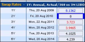
| Figure 3: | Red Text Indicates Invalid Rates |
If you enter your own data, the system will only check its validity, or the validity of subsequent data points, after you click the Calculate or Accept button