
After carrying out back testing for the instrument defined in the pricing page for a defined period (see Activating Back Testing in SDX Interest Rates) you can then see the results in a number of formats:
In a chart format (Viewing the Back Testing Data In a Chart Format )
In the form of statistics (Viewing the Back Testing Data in a Statistical Format)
In an Excel spreadsheet (Viewing the Data in an Excel Spreadsheet )
In the form of distribution & cumulative histograms (Viewing the Data in the Form of Distribution & Cumulative Histograms)
Viewing the Back Testing Data In a Chart Format
In the generated chart you can see the following information (and as seen in Figure 1):
Payout or P/L of the instrument for the expiry date/maturity date.
Zero level.
This shows where the 0 level of the payoff is to be found.
In addition, the scroller area (at the bottom of the main chart) is a simplified representation of the entire data set. It is used by the viewer to move back and forth through the data set.
Figure 1: The Back Testing Graph
This chart was generated for the instrument as defined in Figure 2.
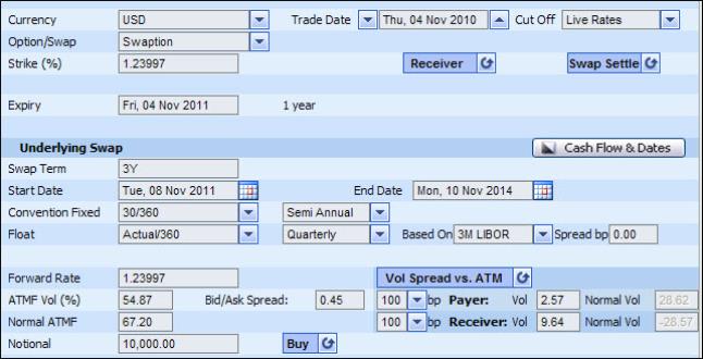
Figure 2: The Instrument Being Back Tested
To access the data in a chart format, after defining the back testing period you click the Display Chart button.
Once the system has generated the chart you can then work with it. For more information see Working With Generated Back Testing Charts & Historical Analysis Charts.
Viewing the Back Testing Data in a Statistical Format
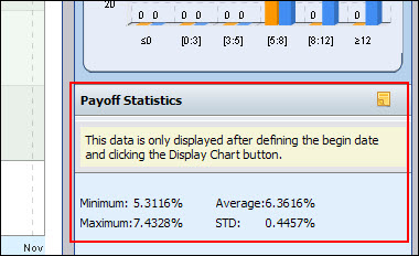
In the Payoff Statistics area you can see the following data (and as seen in Figure 3):
Minimum payout
Maximum payout
Average of all the payouts
Standard deviation of the payouts (STD)
This data is displayed for the instrument defined in the pricing page for the back testing period defined. If you change the back testing period and then click the Display Chart button, the data in this area will be updated as well.
Viewing the Data in an Excel Spreadsheet
You can access the back testing data in an Excel spreadsheet.
To access the data in an Excel spreadsheet:
After defining the back testing period and clicking the Display Chart button you then click the Export button.
Viewing the Data in the Form of Distribution & Cumulative Histograms
In addition to seeing the results in a chart format (Viewing the Back Testing Data In a Chart Format ) and a statistical format (Viewing the Data in the Form of Distribution & Cumulative Histograms), you can also see the annual yield (which is the annual rate of return on an investment, expressed as a percentage) in a histogram format as seen in Figure 4.
What is a histogram? A histogram is a bar chart representing a frequency distribution, where each bar represents the observed frequencies in a particular category. That is, you see what proportion of cases fall into each of several categories.
The back testing tool in SDX Interest Rates displays two types of histogram:.
Distribution histogram
This shows the annual return.
Cumulative histogram
This shows the cumulative annual return, where the results are accumulated from the top to the bottom.
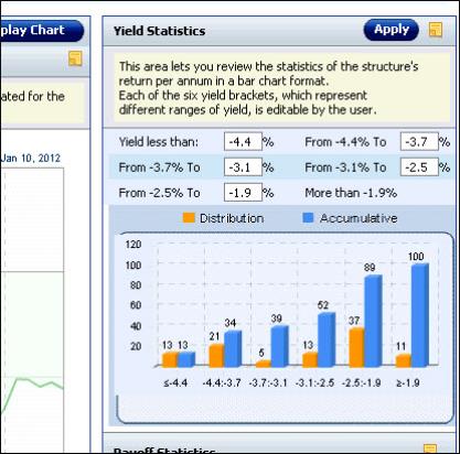
In the back testing tool each bar in the histograms represents a defined range of yield. So you can see the yield that is less than a given percentage, the yield between a range of percentages, and the yield over a given percentage.
By default the range of yield for each bar is dynamically defined on-the-fly depending on the total yield range of the instrument/portfolio currently being backtested. The range of yields is calculated when you click the Display Chart button.
You can then easily edit the range of yield for each bar.
To customize the yield range for each category, in the Yield Statistics area simply edit the required value and then click the Apply button. The system automatically recalculates the histograms accordingly.